
DAY-1 -Accenture Training Program
Head Start Foundation Program
Forms AND Cascading Style Sheet
Introduction:
An HTML form is a section of a document containing normal content, markup, special elements called controls (checkboxes, radio buttons, menus, etc.), and labels on those controls. Users generally "complete" a form by modifying its controls (entering text, selecting menu items, etc.), before submitting the form to an agent for processing (e.g., to a Web server, to a mail server, etc.)

Controls
A control's "control name" is given by its name attribute. The scope of the name attribute for a control within a FORM element is the FORM element.
Each control has both an initial value and a current value, both of which are character strings. Please consult the definition of each control for information about initial values and possible constraints on values imposed by the control. In general, a control's "initial value" may be specified with the control element's value attribute. However, the initial value of a TEXTAREA element is given by its contents, and the initial value of an OBJECT element in a form is determined by the object implementation (i.e., it lies outside the scope of this specification).
The control's "current value" is first set to the initial value. Thereafter, the control's current value may be modified through user interaction and scripts.
A control's initial value does not change. Thus, when a form is reset, each control's current value is reset to its initial value. If a control does not have an initial value, the effect of a form reset on that control is undefined.
When a form is submitted for processing, some controls have their name paired with their current value and these pairs are submitted with the form. Those controls for which name/value pairs are submitted are called successful controls.
Control types
HTML defines the following control types:- buttons
- Authors may create three types of buttons:
- submit buttons: When activated, a submit button submits a form. A form may contain more than one submit button.
- reset buttons: When activated, a reset button resets all controls to their initial values.
- push buttons: Push buttons have no default behavior. Each push button may have client-side scripts associated with the element's event attributes. When an event occurs (e.g., the user presses the button, releases it, etc.), the associated script is triggered. Authors should specify the scripting language of a push button script through a default script declaration (with the META element).
Authors create buttons with the BUTTON element or the INPUT element. Please consult the definitions of these elements for details about specifying different button types.Note. Authors should note that the BUTTON element offers richer rendering capabilities than the INPUT element.- checkboxes
- Checkboxes (and radio buttons) are on/off switches that may be toggled by the user. A switch is "on" when the control element's checked attribute is set. When a form is submitted, only "on" checkbox controls can become successful.Several checkboxes in a form may share the same control name. Thus, for example, checkboxes allow users to select several values for the same property. The INPUT element is used to create a checkbox control.
- radio buttons
- Radio buttons are like checkboxes except that when several share the same control name, they are mutually exclusive: when one is switched "on", all others with the same name are switched "off". The INPUT element is used to create a radio button control.
- If no radio button in a set sharing the same control name is initially "on", user agent behavior for choosing which control is initially "on" is undefined. Note. Since existing implementations handle this case differently, the current specification differs from RFC 1866 ([RFC1866] section 8.1.2.4), which states:
At all times, exactly one of the radio buttons in a set is checked. If none of the elements of a set of radio buttons specifies `CHECKED', then the user agent must check the first radio button of the set initially.
Since user agent behavior differs, authors should ensure that in each set of radio buttons that one is initially "on". - menus
- Menus offer users options from which to choose. The SELECT element creates a menu, in combination with the OPTGROUP and OPTION elements.
- text input
- Authors may create two types of controls that allow users to input text. The INPUT element creates a single-line input control and the TEXTAREA element creates a multi-line input control. In both cases, the input text becomes the control's current value.
- file select
- This control type allows the user to select files so that their contents may be submitted with a form. The INPUT element is used to create a file select control.
- hidden controls
- Authors may create controls that are not rendered but whose values are submitted with a form. Authors generally use this control type to store information between client/server exchanges that would otherwise be lost due to the stateless nature of HTTP (see [RFC2616]). The INPUT element is used to create a hidden control.
- object controls
- Authors may insert generic objects in forms such that associated values are submitted along with other controls. Authors create object controls with the OBJECT element.
The elements used to create controls generally appear inside a FORM element, but may also appear outside of a FORM element declaration when they are used to build user interfaces. This is discussed in the section on intrinsic events. Note that controls outside a form cannot be successful controls.
Attribute definitions
- action = uri [CT]
- This attribute specifies a form processing agent. User agent behavior for a value other than an HTTP URI is undefined.
- method = get|post [CI]
- This attribute specifies which HTTP method will be used to submit the form data set. Possible (case-insensitive) values are "get" (the default) and "post". See the section on form submission for usage information.
- enctype = content-type [CI]
- This attribute specifies the content type used to submit the form to the server (when the value of method is "post"). The default value for this attribute is "application/x-www-form-urlencoded". The value "multipart/form-data" should be used in combination with the INPUT element, type="file".
- accept-charset = charset list [CI]
- This attribute specifies the list of character encodings for input data that is accepted by the server processing this form. The value is a space- and/or comma-delimited list of charset values. The client must interpret this list as an exclusive-or list, i.e., the server is able to accept any single character encoding per entity received. The default value for this attribute is the reserved string "UNKNOWN". User agents may interpret this value as the character encoding that was used to transmit the document containing this FORM element.
- accept = content-type-list [CI]
- This attribute specifies a comma-separated list of content types that a server processing this form will handle correctly. User agents may use this information to filter out non-conforming files when prompting a user to select files to be sent to the server (cf. the INPUT element when type="file").
- name = cdata [CI]
- This attribute names the element so that it may be referred to from style sheets or scripts. Note. This attribute has been included for backwards compatibility. Applications should use the id attribute to identify elements.
- type = text|password|checkbox|radio|submit|reset|file|hidden|image|button [CI]
- This attribute specifies the type of control to create. The default value for this attribute is "text".
- name = cdata [CI]
- This attribute assigns the control name.
- value = cdata [CA]
- This attribute specifies the initial value of the control. It is optional except when the type attribute has the value "radio" or "checkbox".
- size = cdata [CN]
- This attribute tells the user agent the initial width of the control. The width is given in pixels except when type attribute has the value "text" or "password". In that case, its value refers to the (integer) number of characters.
- maxlength = number [CN]
- When the type attribute has the value "text" or "password", this attribute specifies the maximum number of characters the user may enter. This number may exceed the specified size, in which case the user agent should offer a scrolling mechanism. The default value for this attribute is an unlimited number.
- checked [CI]
- When the type attribute has the value "radio" or "checkbox", this boolean attribute specifies that the button is on. User agents must ignore this attribute for other control types.
- src = uri [CT]
- When the type attribute has the value "image", this attribute specifies the location of the image to be used to decorate the graphical submit button.
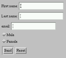
EXAMPLE_2

THIS IS MORE ENOUGH FOR CSS SCRIPTING
No comments:
Post a Comment